 from PTUA President Tony Morton
The rather lightweight* McCrindle presentation of some Census data in the last couple of days seems to have triggered rather a lot of discussion, including a rant from Neil Mitchell on 3AW where he declared that we should forget about public transport, and just build more roads.
It seems rather odd McCrindle’s figures would be presented as news at all given that the same stats were analysed in 2012, and in more detail, by Paul Mees and Lucy Groenhart at RMIT.
What are the real trends?
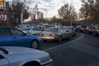
The greatest attention seems to have been reserved for the increase in the absolute numbers of people travelling to work by car. Again this is no surprise: it was pointed out in the RMIT analysis and continues an established trend, but the more important underlying factor (almost completely ignored in the latest circus) is that while previous growth in car travel was due to mode shift in favour of cars, in the last decade it’s all been due to underlying growth in the size of the workforce.
That is the real question of course: we all know car use grows in absolute terms as the population grows, but is car use still growing in relative terms, the way it did through the 20th century?
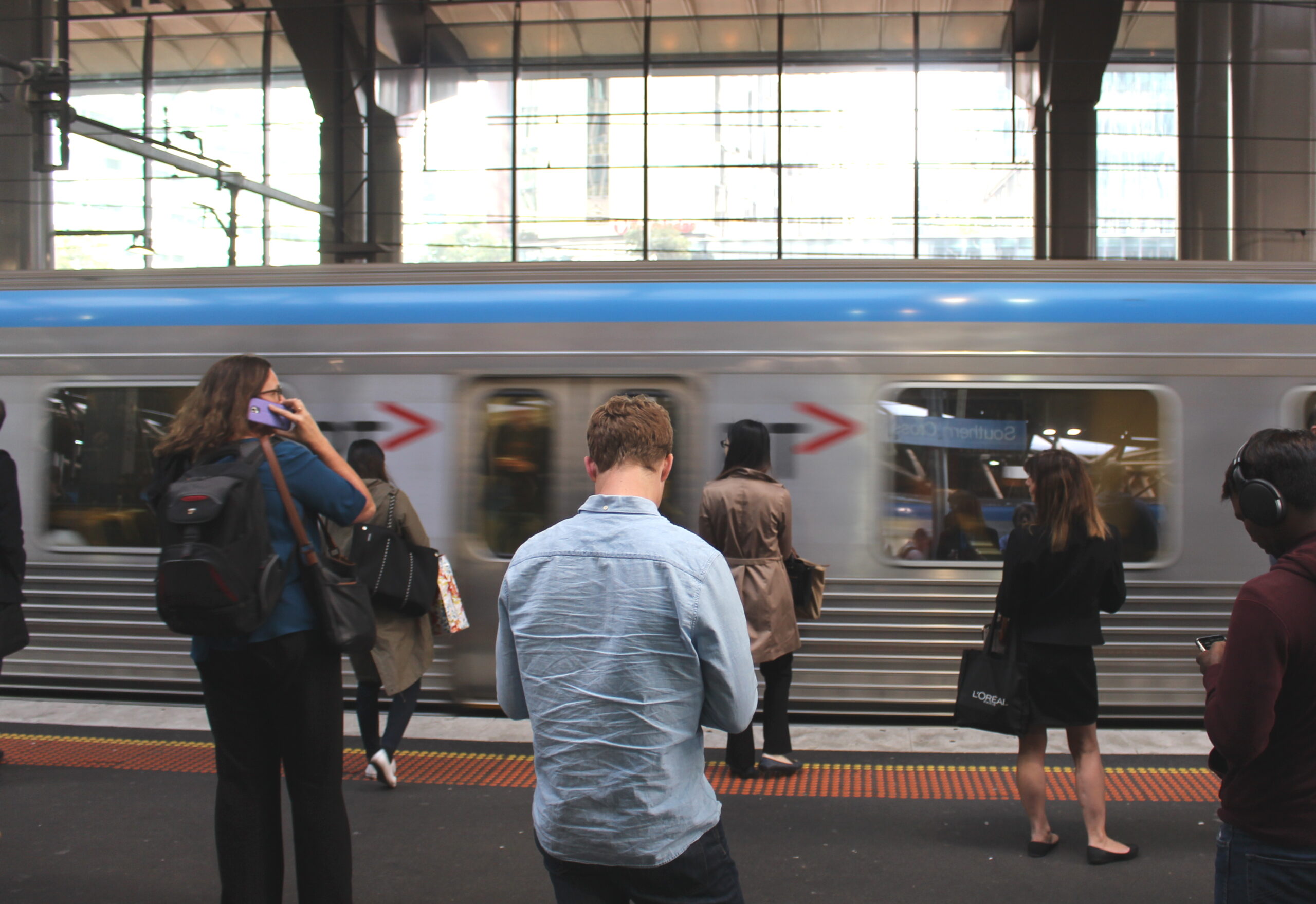
One thing that’s for sure is car use is no longer growing at the expense of public transport. Journeys to work by public transport are growing, and even on the raw figures, the growth in proportion to existing usage rates is greater than for car use. Nonetheless, it’s possible the mode share for car use could be growing at the expense of other methods of travel to work that are more sustainable (like walking or cycling), which would still be a worrying trend.
It turns out that (as with much demographic analysis) the true situation for car mode share is tricky and depends on how you interpret the data. So let’s have a look at the figures direct from the source.
First, the nationwide picture. The ABS Community Profile for Australia includes counts of ‘method of travel to work’ from which one can determine people’s ‘main mode’ of travel much as per the RMIT analysis: public transport, car/truck, cycling, walking and other – in that priority order when more than one mode is used. This gives us the following counts:
- Persons who travelled to work by car as driver, car as passenger, truck, or two or more methods not including train or bus (“car commuters”): 6,768,191 in 2011 and 6,107,666 in 2006.
- Persons who travelled to work by train, bus, ferry, tram, or by two or more methods including train or bus (“PT commuters”): 1,037,389 in 2011 and 816,943 in 2006.
Straight away we can see the relative growth was much greater for public transport: 27.0 per cent over 5 years, compared to 10.8 per cent for car travel.
Crunching the numbers
To work out mode shares is more subtle, because we need a ‘reference population’ to serve as the denominator. Since we’re looking specifically at travel to work, we should clearly be dividing by some measure of the ‘commuting population’ to get the actual mode share. But here we need to be careful because the Census data gives us some not-quite-equivalent alternatives.
- P1 – Persons who are employed and aged 15 or over (and were therefore asked the ‘method of travel’ question on the Census): 10,058,325 in 2011 and 9,104,184 in 2006.
- P2 – Employed persons who actually answered the ‘method of travel’ question: 9,908,394 in 2011 and 8,940,207 in 2006.
- P3 – Employed persons who responded and actually worked on Census day: 8,883,512 in 2011 and 7,945,032 in 2006.
- P4 – Employed persons who worked on Census day at a workplace separate from home, so actually travelled to work: 8,439,573 in 2011 and 7,518,506 in 2006.
The really tricky thing here is that these four measures of ‘commuting population’ all increased at different rates between 2006 and 2011: by 10.5 per cent, 10.8 per cent, 11.8 per cent and 12.3 per cent respectively. Since travel to work by car grew by 10.8 per cent in absolute numbers over that time, the car mode share will show a slight increase based on the first measure, no change on the second, and a decline on the third or fourth measures.
So which of these outcomes is ‘correct’? There’s a strong argument for excluding P1 in comparison with P2, P3 and P4, because including non-responders is guaranteed to bias all your figures downward. Likewise one can argue pretty strongly for excluding P2 in favour of P3 or P4, since if someone has no journey to work on Census day, it makes no essential difference for our purposes whether it’s because they’re not in the workforce at all, or because they weren’t at work on that specific day.
Where one can argue the toss is between P3 and P4, which comes down to the question of whether or not ‘teleworking’ counts as a method of travel to work. But the answer to this question depends on the purpose of looking at these statistics in the first place. If we are interested specifically in how workers manage the daily commute between home and the workplace, it may be quite relevant to regard working from home as in competition with going to work by specific methods. But if one is a transport planner looking specifically at travel, and using journeys to work as a proxy for travel trends in general, the trends in working from home are relevant only in that they affect the volume of the total transport task: they’re not really relevant to how car use, public transport and other transport modes compete with one another.
The real trend: car mode share down, public transport up
In any case it doesn’t matter whether one prefers P3 or P4 for this exercise, because both show car mode share to have declined between 2006 and 2011: by 0.7 percentage points based on P3 and by 1.0 percentage points based on P4. (And if you look solely at ‘car as driver’ plus ‘car as passenger’ as the ABS and the RMIT study both do, the decline is slightly greater.)
Meanwhile, the public transport commuter figures show a clear gain in mode share no matter what measure of population is used. The increase is by 1.4 percentage points based on either P3 or P4 and by 1.3 percentage points based on P1 or P2.
If we look just at Melbourne, the situation is less ambiguous still. The following figures are for the Melbourne ‘Urban Centre’, which is the urbanised area within the greater Melbourne statistical boundary. (The RMIT study considered everyone within the statistical boundary, in order to get a consistent picture back to 1976.)
- Car commuters: 1,170,653 in 2011 and 1,055,224 in 2006.
- Public transport commuters: 255,704 in 2011 and 191,867 in 2006.
- P3 commuter population: 1,587,832 in 2011 and 1,385,887 in 2006.
- P4 commuter population: 1,524,583 in 2011 and 1,330,979 in 2006.
Melbourne: even stronger public transport growth
The increase in car journeys is in line with the nationwide figure, but the increase in public transport journeys is even more emphatic: 33 per cent over the five year period. And regardless of the population measure, there’s a clear decline in car mode share and an increase in public transport mode share, in both cases by around 2.4 percentage points. (Which not surprisingly is similar to what the RMIT study found, even with the slight difference in the study areas and the definition of ‘car commuting’.)
Which goes to show Neil Mitchell’s cries to abandon public transport and just build more roads were over-the-top.
The question for policymakers is: where to from here? Do we want more roads to encourage more cars onto the road, or more public transport services to encourage more people in our cities to get around more efficiently and sustainably?
* By the way, anybody can get hold of any of the data from McCrindle’s study in two minutes from the Bureau of Statistics website, without getting consultants to do the research for you. Just go to abs.gov.au, click the ‘Census’ tab near the top of the page and type ‘Australia’ into the QuickStats search box. The ‘Travel to work’ highlights are visible near the bottom when you expand the ‘People’ tab in the search results. They provide the figures for both 2011 and 2006.